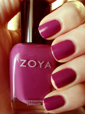
Back in August during my Olympics revelry, I got bit by the purple bug due to the games’ use of the color all over everything. Accordingly, I made two quick Zoya purchases–Charisma, which I reviewed a few months ago, and Kieko, from their Summertime 2011 collection.
I had to alter the colors in the photograph, because purple will NEVER PHOTOGRAPH CORRECTLY. Honestly, I don’t know why I bother to look up purple polishes on the internet before buying them. They NEVER turn out how I expect them to. The picture below is how it originally photographed.
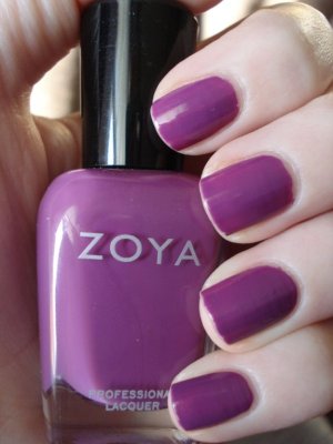
NO THIS IS NOT WHAT YOU LOOK LIKE WHY DO YOU HAVE TO PHOTOGRAPH THIS WAY WHY CAN’T CAMERAS JUST TAKE COLOR ACCURATE PHOTOS IT IS 2012.
I feel like color-edited pictures always end up looking a bit funky, but I CANNOT STAND color inaccuracy. Kieko photographs almost cool toned, but it’s definitely warm. The first coat damn near looks pink. Anyway, it was a typical wonderful two-coat Zoya cream, and it really is a lovely dusky purple–with enough dusk that I think it transitions to autumn and even the holidays rather nicely.
Is this similar to one of the purples used during the Olympics? I don’t even know. Who knows what those colors really looked like compared to what I saw on my television screen. I…I have to stop, or I will have an inaccuracy-induced meltdown.
